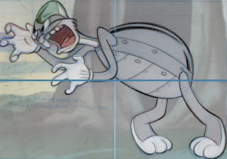
The reason is, the manner in which this pose is organized fascinated me, Bugs feels so aggravated and somewhat cramped in his upper part, but still reads so clearly and gracefully overall, I wanted to analyze the layout of the points on interest before being distracted by drawing the character's details.
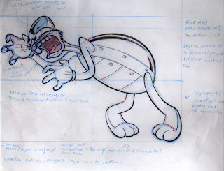
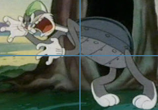 Judging by the divisions, I measured the points of interest carefully, and drew them while comparing them with the original.
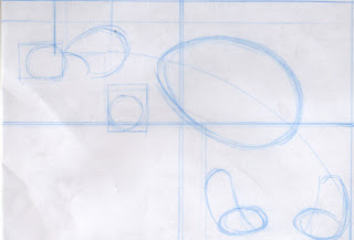 Notice the smart division: The main parts of Bugs' expression: Head and arms/hands, are concentrated in the top left part of the composition (This is a lot for this space, thus a slightly cramped feeling, which works perfectly for the pose, and still reads clearly)
The other major part of his expression: his legs, are concentrated on the bottom right part.
The top right part: Bug's torso/turtle suit (modern design),is a simple shape, it reads clearly, it's purpose is to connect the line of action from head to foot, notice that the direction of Bugs' legs resists the line of action, this contributes to the frustrated expression.
The lower left corner is left blank! this makes perfect sense for the path of action, which is located on the other 3 parts, there is no distraction from it!
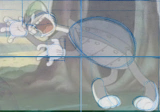 Then I proceeded to the first level of forms, checking if I had all the parts in the right place.
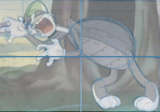 As I was moving to the second level of forms I noticed more details:
Bugs' fingers on his screen left hand are all making the same gesture, it's the different angles that gives them pleasing asymmetry, the screen right hand has asymmetry also in the finger's gesture.
The lip wraps around the chin, both the chin and the tongue can be broken down to one ellipse shape, and the lip helps to separate it, Bugs' cap functions as the top of his brow.
 This division method turned out very well, because it helped me get close to the original composition early, so I only needed to draw this pose once, usually when I start with a gesture, I end up making too many corrections.
peace.


11 comments:
awesome analysis and effort!!
Wow nice stuff. Again :D
I also did something like that, but I just diveded it in my head. I always had the feeling that it was like some kind of cheating. But I geus it's not. It's all about the analysis right?
I sometimes get the feeling that I don't make progress enough and then I am thinking that I need to draw own stuff (I am quite impatient). But seeing how you are studying makes my realize that this really is important.
Wow, your lines are actually improving! I didn't think they had anywhere left to go.
Did you get mostly this on your first shot? I'm impressed, again.
Thanks Mitch! this was my only shot, I didn't re-do this.
A stunning effort as usual amir. I would love to work with you one day.
Gee, thanks PC! Great Bugs drawing in your new post
Excellent study. I'm only a week into the lessons myself. Take a look when you can. Thanks.
http://chrisdraws.blogspot.com/
Good approach, but too cold and mathematical for me. All that effort just to get an incredibly accurate copy. Why not just trace it? I am trying to get as close to the original but still maintain some sense of an organic feel to it. I understand your searching for new approaches but isn't this how they blow up drawings for murals? Just my opinion. No insult intended.
Nice analysis, Amir. Great use of Photoshop as a study tool.
Thanks Marc!
I found you explanation of
your approach very helpful.
I've linked to it on my January 24, 2009 post.
http://anotherstinkincartoonblog.blogspot.com/
Keep up the great work.
Your stuff looks awesome!
Post a Comment